
The following was content for a presentation I did for Churchill Creative at their team meetup.
5 Ways to Sink a Potentially Great Website
- Make your menus as complicated as you can
- Overload your site with duplicate content
- Use sliders everywhere
- Make it as difficult as you can for someone to contact you
- BOLD AND CAPILTALIZE EVERYTHING, BECAUSE IT’S IMPORTANT!!!!
Now that we know how to completely break things, let’s look at a few ways to avoid these mistakes.
Simplify overcomplicated menus
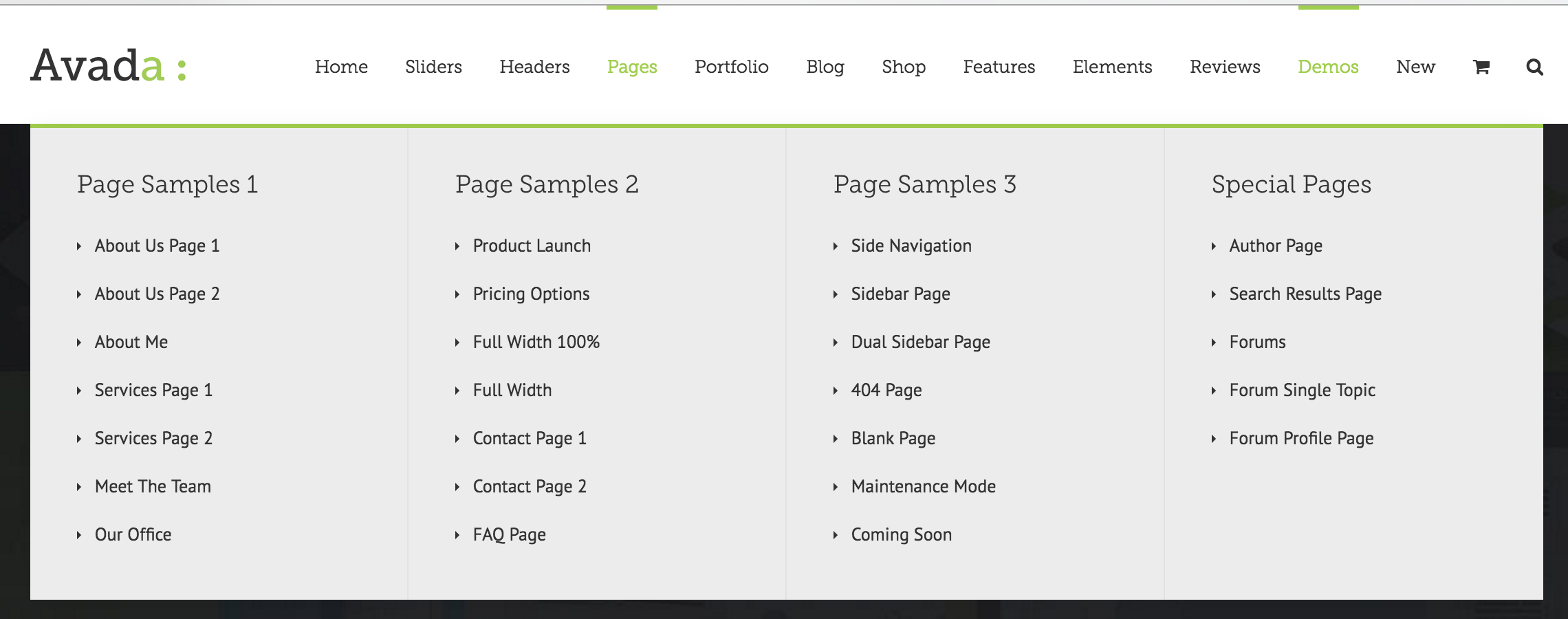
Menus need to be simple and easy to navigation. Adding too many options will hinder people from digging deeper into the website.
- Keep each level around 3 to 5 options
- Never repeat a menu item by linking to the same page
- Use short common names for menu items
Remove/repurpose duplicate content
If you have something good to say, then say it. Coping and pasting a bunch of content all over the website doesn’t add value to the visitor. It adds confusion. Take your good content and find a different ways to express it. Write content for humans not for search engines.
Don’t overuse sliders
Some would argue that you should never use a slider (http://shouldiuseacarousel.com). I would suggest don’t over overuse sliders.
- Less is better
- Each slider a simple title and image
Make your contact info prominent
Hiding email and phone number is a quick way to annoy your visitors. One of the primary reasons people visit your website is for contact infomation.
- Visually make email and phone stand out.
- Put your email address or at the very least a contact form on your contact page.
Emphasize and highlight the most important parts
When everything is important, nothing is important. Only highlight or emphasize things that are truly important. When writing content for a blog, a reader should be able to get the main points by reading headers and other highlighted portions.
Takeaways? Keep it Simple.