Brand
The mark, wordmark, colour and type that make Anchor Hosting look like Anchor Hosting. Download the assets below — everything else on this page explains how to use them.
Logo
One drawing, three treatments: the lockup where there is room, the bare mark where there is not, the tile only where a square icon is required.

Downloads
Download everything (.zip)
Lockup
Mark + wordmark, for headers, documents and anywhere there is room.
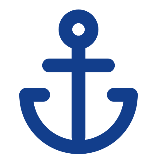
Mark
The bare anchor glyph. The default — it stands without a tile.

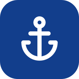
App icon
White mark on a navy rounded tile — avatars, favicons, app icons only.
Social avatar
The mark with extra whitespace so circular crops (X, Slack, GitHub) don’t pinch the arms.

Legacy
The 2015 logo, kept for reference. Retired — do not use in new work.
Colour
The palette is defined twice — once for light, once for dark. Every colour in the product goes through a token; nothing is hardcoded.
Light
Dark
Type
Using the mark
Do
- Use the bare navy mark on light surfaces, the white mark on navy, photos or dark surfaces.
- Scale the mark as a whole — the stroke weight is part of the drawing.
- Keep clearspace of at least half the mark’s height on every side.
- Set the wordmark in Plus Jakarta Sans Bold with −1% tracking, cap-height aligned to the mark.
- Use the rounded tile only where a square avatar or app icon is required.
Don't
- Don’t redraw, outline, thicken or thin the anchor glyph.
- Don’t place the bare mark inside a tile of any other colour.
- Don’t retype the wordmark in another typeface or weight.
- Don’t introduce colours outside the palette on this page.
- Don’t use the mark smaller than 16px, or the lockup smaller than 24px tall.
- Don’t mix the retired 2015 logo with the current mark.